Irene Kyuhee Noh
 
LEGOMAIN_ANIMATE.gif
 

Lego-Fy Mobile AR App


Objective: 

Design and create a clickable prototype of mobile AR/VR application to help encourage and develop creativity back into Lego building experience.

Timeframe: 2 weeks

My Role

UX/UI Designer & Project Manager

Team

Tinnie Choi, Kelsey Vu, Irene Noh

Tools

Whiteboard, Sketch App, Principle, Illustrator, Photoshop, Keynote, Asana, Slack, Google Drive


LEGO.gif


DOTS.png
 
 
DISCOVER.gif


DISCOVER: Look for meaning

We began our research with three main focuses: researching on the current AR/VR application, the Lego brand, and the users.


Learning the current AR/VR application: Heuristic Analysis and C&C Analysis

We kick started our research by conducting Heuristic Analysis on the current LEGO AR Studio app to understand the problem of the existing app. Heuristic Analysis is a great tool to learn about the existing app, finding usability problems in a user interface design and evaluate each problem. We used the LEMERs method by Jakob Nielsen, who stated that usability is defined by 5 quality components:

  1. Learnability: How easy is it for users to accomplish basic tasks the first time they encounter the design?

  2. Efficiency: Once users have learned the design, how quickly can they perform tasks?

  3. Memorability: When users return to the design after a period of not using it, how easily can they reestablish proficiency?

  4. Errors: How many errors do users make, how severe are these errors, and how easily can they recover from the errors?

  5. Satisfaction: How pleasant is it to use the design?

From this evaluation, we have learned that current Lego AR app has many usability problems such as lack of instruction for users, the VR screens doe not always stay at its place when moving the camera away and the app drains out battery quickly.

After learning the existing app, we compared the app with other three different AR/VR apps that are relatively successful in the current market: Pokemon Go, Ikea Place and Qlone.

We used Competitive & Comparative Analysis, a tool that helps to learn about industry conventions and how we may differentiate our product from what already exists. This method also helps align our design with other designs to define and prioritize product goals.


Understanding the Lego brand: Business Model Canvas and Documentaries

After learning about the current Lego AR App, we watched few Lego documentaries such as LEGO House and A Lego Brickumentary to learn about the history of Lego brand, Then. we wanted to learn about the main purpose of our project; what problem we are solving, who we are solving it for and what exactly our product or service is. Doing so, we wanted to dig deep into our brand, the Lego.

We used the Business Model Canvas, the tool that helped us to describe, design, challenge, invent, and pivot our business model. The Business Model Canvas breaks our Lego brand down into easily-understood segments: Key Partners, Key Activities, Key Resources, Value Propositions, Customer Relationships, Channels, Customer Segments, Cost Structure, and Revenue Streams.

Our main focus segment for this exercise was Value Propositions, where we list all the benefits and features of our Lego brand and what they could do to solve a problem. After listing few of keywords on the value proposition, the value that stands out the most was “Tactile”. We realized, developing creativity through the tactile building is the most value-able proposition of the Lego company.


Discovering target users: User Survey

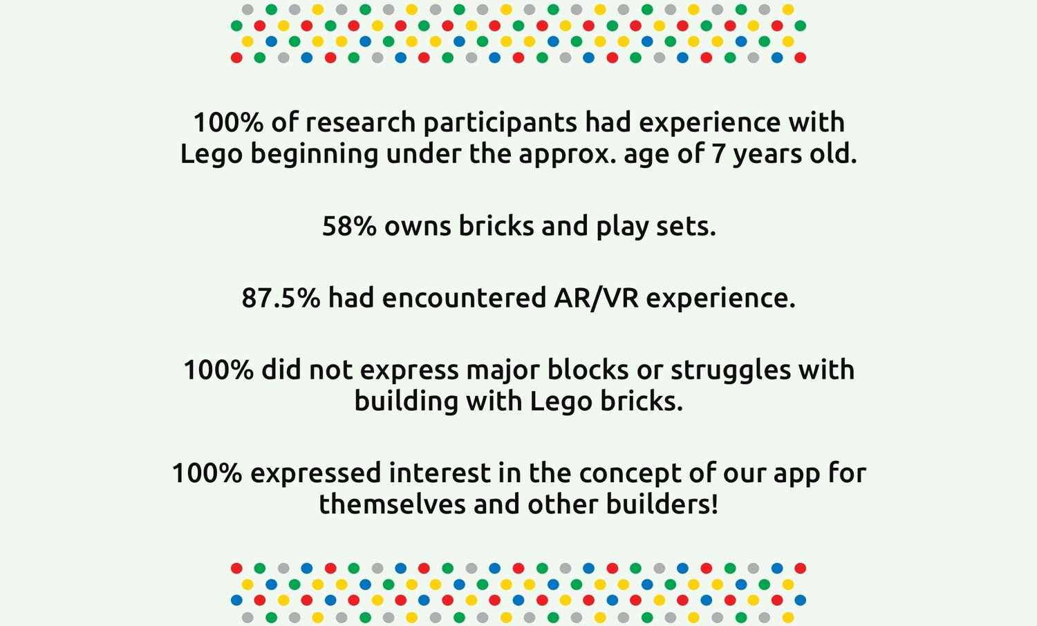
On the end of researching stage, we created 14 survey question to learn about our users. The survey was successfully completed, we got a decent amount of responses with detailed comments. The User Survey helped us to discover what motivates survey respondents and what is important to them, and gather meaningful opinions, comments, and feedback. 

As we synthesized our research findings, we were able to come up with few ideas of our new application and began to shape our targeted users.


Key Research Findings : Our Challenges

 
PROBLEM.png

After synthesizing our findings, we identified some key user pain points:

  • Lego players tend to buy sets but they forego their creative development by doing that. 

  • Besides seeing Lego sets interact in AR, there’s nothing much to do after that in the app.

  • The AR app keeps users in the virtual world but not leading back into the tactile world.


DOTS.png


DEFINE: Edit insight

Based on our research findings and understanding the pain points of the users, we decided the direction of our project to design a product that encourages tactile building instead of simply selling the current Lego AR Studio application.


Project Direction : Defining our problem & goal

 
GOAL.png
 
SOLUTION.png

OUR Problem

Lego Builders creativity has declined due to the commercial sets flooding the market

that promotes preservation instead of creative development.

How might we leverage technology to encourage and develop creativity? 


OUR GOAL

We want to utilize AR technology to help bring creativity back into Lego building

experience. 


User Persona: Say Hello to Adrian!


After deciding our project path, we created a persona to help guide us our design process, ensuring that we are designing for our users as they actually are, and as they actually behave.

The User Persona is necessary to the success of a product because it helps design decisions by taking common user needs and bringing them to the forefront of planning before the design stage has actually started. Persona provided our team with a shared understanding of our targeted users in terms of our goals and capabilities.

We created persona Adrian, who is semi-creative and not afraid of challenging himself to grow.

Persona.jpg


DEVELOP.gif
 

DEVELOP: Explore Possibilities

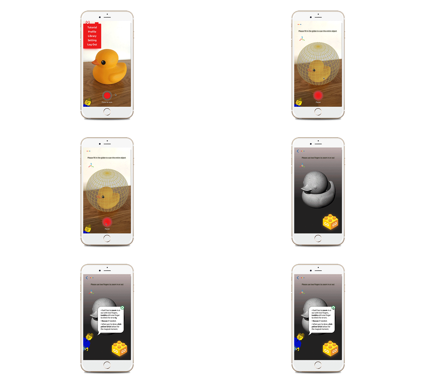
We combined all the research findings and narrowed them down to the idea of new AR app called “Lego-fy”. Lego builders can use this app to 3D scan any real-life objects and it “Lego-fy”s to show the amount of Lego bricks that require to build the object. We decided to not include a Lego instruction to our product so the user can build their own object with their creativity. Just as a puzzle, users will create their own puzzle project and build them once they receive it.


Team Brainstorming: Design Concepts & Features


Beginning of our design process, we spent hours to Brainstorm and throw all the ideas onto the white board. We also did design exercise called Design Studio that requires us to quickly sketch our ideas within limited amount of time, which helped us to squeeze our design ideas. After this exercise, we were able to come up with lists of basic screen ideas to potential features.

DESIGNCONCEPT.png
 

Structuring Our Design: Site Map and User Flow

We used various Information Architecture methods, such as Card Sorting and Feature Prioritization to began structuring our application.

Our team conducted feature prioritization to identified what features were necessary and eliminate others. We used the MOSCOW method where we could divide features into four different section: Must-haves, Should-haves, Could-haves, Wont’(Can’t)-have.

After deciding on our features, we conducted card sorting to test out our decision. Card Sorting is a tool that allows you to prioritize and organize information in a way that accurately represents the user’s mental model. There are few types of card sorting and for our design, we decided to use open card sorting that participants sort cards into categories that make sense to them, and label each category themselves

These processes helped us to create the Site Map and User Flow of our app that are effective planning tool to clarify our site’s purpose and goals.


Sketches: Low-Fidelity Wireframes and Usability Testing


Based on our site mapping, we were able to quickly sketch out our first drafts of wireframes. After visualizing our ideas, we conducted usability testing that helped us to find and fix problems of our design.

Screen Shot 2018-09-19 at 3.35.07 PM.png
UsabilityTesting.jpg
IMG_1239.JPG
 
 
DOTS.png
 
DELIVER.gif
 

DELIVER: Prototype, Test, Revise and Repeat

After sketching the lo-fi wireframes, we created style guide to share the concepts then finally began to finalized our design by building hi-fi wireframes.


Final Sketch: Style Guide and High-fidelity Wireframes


Going back to our researching stage, one of the Lego documentary that we watched helps us to create a style guide to share mood and theme of our design for hi-fi wireframes. Lego House - Home of the Brick taught us that Lego is an iconic household brand. We decided to use Ubutu font from Lego brand and their main themes colors - Red, Yellow, Blue and green on our application through our project presentation.

The feedbacks from our usability testing of lo-fi wireframes and using our style guide, we were able to create our 1st draft of hi-fi wireframe.


Hi-fi Wireframes


Final Revision: Class Feedback Workshop


The class feedback workshop really helped us to give final touch on our design. The workshop was divided into two stages: Silence feedback session where everyone walked around quietly and leave feedbacks on each screens via post-its. Then we got stickers to vote on other’s feedbacks. Our team got great comments and feedbacks from 13 other classmates and 2 of our instructors, which helped me jumping into create clickable prototype using our final screens.


Motion Graphic : Bringing it to live


After creating final screens, I created clickable prototype using Principle app to add some necessary animations to our final product. The Principle helps it easy to design animated which was perfect program to create our rapid-prototype.

PRINCIPLE SCREEN.png


Final Product: Clickable Prototype


Thank you!


Say Hello!


kinoh91@gmail.com
irenenoh.com
https://www.linkedin.com/in/irene-noh/