Irene Kyuhee Noh
Hero.png

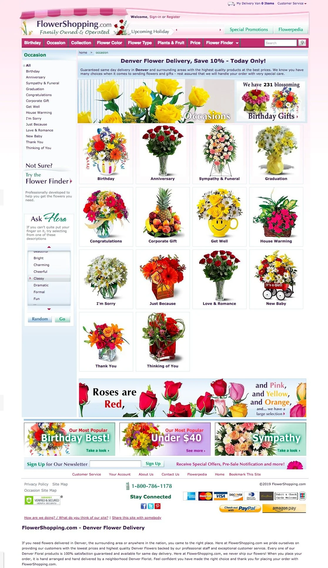
flowershopping.com responsive design


Project: Florist eCommerce Website Rebrand and Redesign

My Role: UX/UI Designer

Team: Product Owner and UX Designer

Timeframe: 6 month

Platform: Desktop, Tablet and Mobile

Tools: Pen/Papers, Photoshop and Sketch App

Project Overview:

FlowerShopping.com is a family-owned florist that has specializes nationwide delivery since 1910. Many of their customers order the products through the their website. However, their current website is very outdated and not user-friendly. My target objective for this project was to re-brand and re-design their entire website to make it simple, modern, and most importantly, mobile-friendly.


DISCOVER.gif
 

I. DISCOVER : Look for meaning

Client Recap

C&C Analysis


Client Recap

The most important part of this project was to make the site cleaner, more efficient, and responsive. My client requested to start with the landing page under desktop platform, including updating the mega navigation. Once I came up with a pleasing look and feel, I then moved on to the rest of the interior pages:

  • Department page

  • Category page

  • Unique category page for “Sympathy”

  • Product page

  • Delivery van

  • Checkout page

  • Confirmation page


Heuristic Analysis and C&C Analysis

I kick started this project by conducting Heuristic Analysis on the current website to understand the problem. From the analysis, I have learned the current website has many problems, such as small font size, repeating information on the landing page, and confusing mobile user flow.

After learning about our website’s aspects, I compared it with other florist websites in the market to learn about industry conventions and how we may differentiate our site from what already exists. This method also helps align our design with other competitive designs to define and prioritize product goals.


DEFINE.gif


II. DEFINE : Edit insight

Problems


Problems

My client provided some of the complaints they got from their customers:

  • Confusing site flow

  • Difficult reading font and size

  • Time consuming checkout process

  • Challenging mobile navigation

So I combined these pain-points with the research findings and began to visualize.


DEFINE.gif
 

III. DEVELOP : Explore Possibilities

Lo-Fi Sketches

Lo-Fi Wireframes: Before and After


Lo-Fi Sketches

First basic sketches from the research


Lo-Fi Wireframes

Lo-Fi Landing Page (Before)

My first round of lo-fi wireframe design was to have a very simple layout, displaying upcoming occasional items on the hero and following up with featured items.

However, my client directs most of their PPC advertising traffic to the landing page to accommodate all users. This first design would work for other merchants who direct most of their PPC advertising to internal pages, and not their landing page.


Lo-Fi Landing Page and Internal Pages (After)

The client’s request was difficult to incorporate while maintaining a clean, efficient look of the landing page. So after some hiccups, I finally came up with a new landing page layout and rest of the internal pages.


DELIVER.gif
 

IllI. DELIVER : Prototype, Test, Revise and Repeat

Branding Guide

Final Product: Hi-Fi Wireframes

Before and After Comparison


Branding Guide

From one of the meetings with my client, I realized branding was one of their biggest issues. They currently do not have a branding guide; it is mostly a dark shade pink and not appealing.

So I chose coral pink as the primary color to give more local and warmth to the website. Through this new color branding, I was able to utilize very limited secondary colors to have a clean and modern concept.


Final Product: Hi-Fi Wireframes

Desktop Hi-Fi Wireframe

I used the branding guide to create the final desktop landing page with a new mega navigation. My client was very pleased with the mockups, so I created the rest of the internal pages using the new branding as a guide.


Mobile Hi-Fi Wireframe

After designing the desktop mockups, I created mockups for mobile. One of the challenges I had was how to make the checkout process more intuitive.
I wanted to separate the checkout pages into three parts:

  • Shipping information

  • Payment

  • Order review

    Unfortunately, my client insisted the checkout page to be a "ONE-click check out" page, which may cause the user to get lost in the long process. Working with the client’s request, I decided to add a progress bar on the very top.
    When a user scrolls down the page, the progress bar stays on the top following each step.


Thank you!


Say Hello!


kinoh91@gmail.com
irenenoh.com
https://www.linkedin.com/in/irene-noh/