Irene Kyuhee Noh
MotionMain.jpg

Motion Fitness Group


Project: Website Redesign

My Role: UX/UI Designer

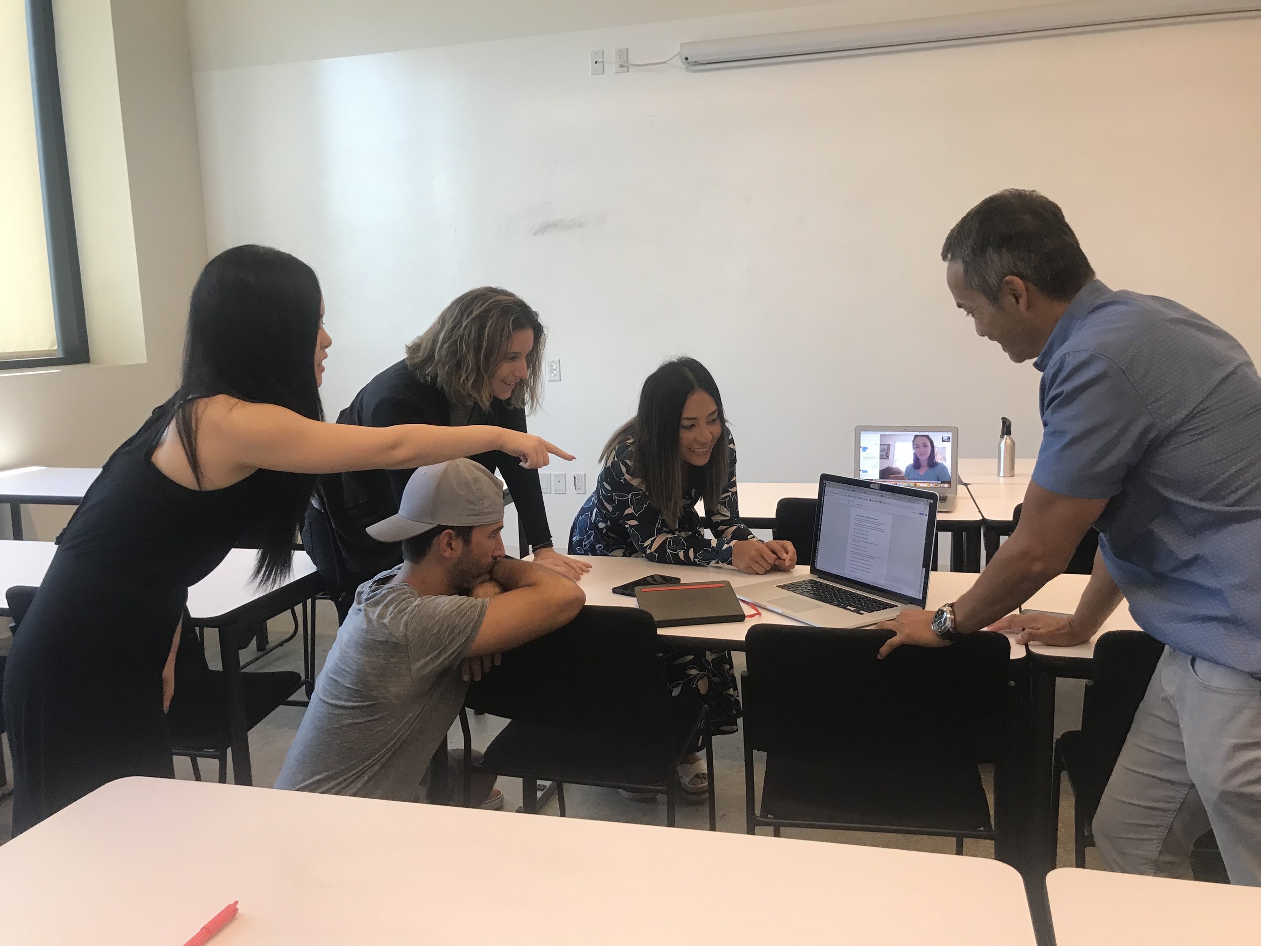
Team: Monica Timpson, Jannie Goldfarb, Irene Noh

Timeframe: 2 weeks

Tools: Whiteboard, Sketch App, Principle, Illustrator, Photoshop, Keynote, Slack, Google Drive

Project Overview:

Motion Fitness Group is a Circuit Training Gym located inside Irvine's Financial District. Their group training sessions with high-intensity mix of all types of music is becoming very popular in the area. Our target objectives for this project was to re-design and re-brand the website to increase new member sign-ups and to utilize seamless check out process for users.


DISCOVER.gif
 

I. DISCOVER : Look for meaning

Client Recap

Heuristic Evaluation

C&C Analysis

Usability Test

Field Research

User Survey


Client Recap

Beginning of this project, our client and my team had a meeting to help define the scope of the project. We had a better sense of what the CEO and Marketing Managers of Motion Fitness Group hope to gain from this project:

  • A re-brand to represent their characteristics of the gym

  • A re-design to increase new member sign-ups


Heuristic Evaluation

The first step of our research process was conducting a heuristic evaluation of Motion Fitness’s existing site. We used Jakob Nielsen's 10 heuristics of usability to evaluate and gather which heuristics were violated and rated them by severity. The main key takeaways from the evaluation were as follows:

  • Confusing site navigation

  • Lack of gym information

  • Frustrating sign up process

  • Lengthy and tedious class sign up process


Competitive & Comparative Analysis    

We then took the next step to search the current fitness center market and discover the main competitors. We wanted to analyze these competitors to uncover how their sites’ function and perform. From here, we were able to create a better understanding of the key features required for Motion Fitness Group’s website. The main takeaways from the analysis were as follows:

  • All the competitors had a clear “About” and “Location” navigation to give their gym information or mission statement to the users, in which Motion Fitness’s website lacked.

  • Some of the competitors had an introduction video to present their main theme of the gym.

  • Most competitors had a “FAQ” and “Pricing” on their websites to guide new guests, while Motion Fitness only provided information about their trainers and class schedules.

Screen Shot 2018-10-10 at 10.53.39 PM.png
 

Usability Testing

We asked some of our classmates to conduct usability test on the current website to prove that our findings were accurate. The notable quotes from the testing were:

“IF THERE WAS MORE CLASS DETAIL I WOULD HAVE SIGNED UP, BUT I NEED TO KNOW IT’S WORTH IT”

“I LEFT THE SITE BECAUSE IT WAS TOO DIFFICULT AND CONFUSING TO SIGN UP FOR A CLASS”


Field Research       

We wanted to understand the characteristics of Motion Fitness and the best way was to visit their gym. Our team drove down to Irvine and attended one of their classes to learn about their style of fitness. During the visit, we were able to conduct user interviews with some of current Motion Fitness clients and find out their opinion about the gym:

  • Majority of the clients joined because they followed their former trainers

  • Clients enjoyed the group classes due to personalized attention from the trainer(s)

  • Book classes via mobile app because website was not easy to use


User Survey

Lastly, we sent out a User Survey to find out about people’s opinions regarding gyms. From 53 responses, we found out that people care mostly about the location and pricing when picking a gym. They use website to view pricing of packages and classes provided by the gym. We used these research findings and began to shape our design.


DEFINE.gif


II. DEFINE : Edit insight

Problems & Solutions

User Persona

User Journey Map


Problems & Solutions

Based on our research findings, we gathered the main problems of the current website and came up with solutions:

Problems:

  • Does not accurately represent Motion Fitness brand

  • Not enough information (no mission statement, FAQ, pricing)

  • New users are unable to get insight of what Motion Fitness offers when visiting the website

  • Current sign-up process for classes is disjointed and confusing, which causes users to leave the site before signing up for classes

Frame.jpg

Solutions:

  • Re-design website to reflect Motion Fitness’s brand

  • Increase website visitors by providing to try free classes

  • Streamline so users can easily book classes

  • Add detailed information so potential clients are able to better understand what Motion Fitness has to offer

  • Improve customer experience by implementing faster and easier navigation


User Persona

We took the time to combine our findings and solutions to refine the user persona to help our design decisions as we always had the end user in mind.


User Journey Map

Demonstrating Racheal’s scenario via User Journey Map


DEFINE.gif
 

III. DEVELOP : Explore Possibilities

Card sorting

Lo-Fi Sketches

Usability Test


Card Sorting

We conducted several open card sorts to choose and group categories for swifter navigation. We also wanted to prioritize and organize information in a way that accurately represents the user’s mental model. These steps helped us create our new Site Map of the website, which is an effective planning tool to clarify our site’s purpose and goals.


Lo-Fi Sketches

After countless group brainstorming sessions and design studio, we finally came up with our first wireframes of our design.

 
lofi.jpg


Usability Test

We used our lo-fi wireframes to conduct usability test to learn what issues presented itself in our design.

 
Screen Shot 2018-10-10 at 11.27.27 PM.png


DELIVER.gif
 

IIII. DELIVER : Prototype, Test, Revise and Repeat

Branding

Hi-Fi Wireframes

User Journey Map

Prototype

Final Product

Next Steps


Branding

We used keywords from our research findings to create a Moodboard for branding.


Hi-Fi Wireframes

Finally, we gathered results from the usability test to fix our design and add our branding to create high fidelity wireframes.


Prototype

From our final wireframes, we began to create a clickable prototype to present our design to our client. We initially used InVision to quickly build the prototype, but due to the limitations the software provided, we decided to use Principle app instead. Through this app, we were able to add advanced interactions to demonstrate our website as if it was live.


 Next Steps >

  • Usability tests with new users with Hi-Fi designs

  • Add flow for purchasing a package

  • Add more features to Dashboard for more personalizations

  • Re-design mobile app to align with website

Thank you!


Say Hello!


kinoh91@gmail.com
irenenoh.com
https://www.linkedin.com/in/irene-noh/