Irene Kyuhee Noh


Non-profit Organization Website Re-design


Project: Non-profit Organization Website Re-design

My Role: UX Designer  

Timeframe: 2 Weeks

Tools: Pen and Paper, Figma, Photoshop, and Illustrator 

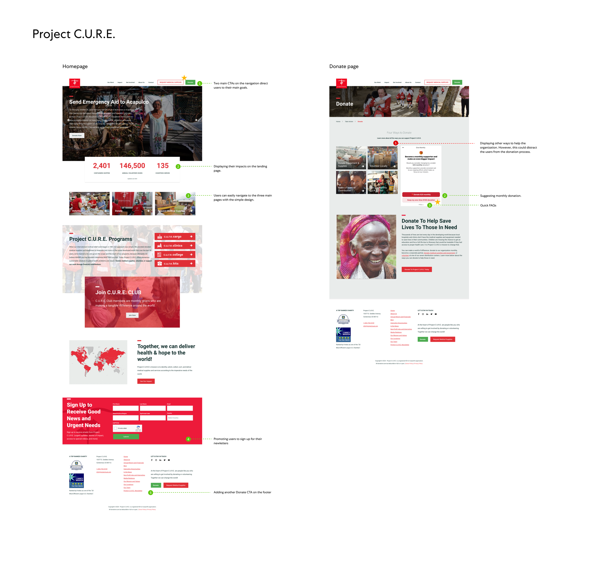
Background: Tip it Forward is a non-profit organization that heavily relies on volunteers and charitable donations to serve their community. Although the website provides useful information, there is still room for improvement in terms of increasing the number of qualified volunteer applicants and charitable donations.

Overall goals are to:

  • Provide design solution to increase the number of qualified volunteer application per month.

  • Provide design solution to increase the number of donors and dollar amount of donations per month.

  • Enhance the navigation structure (sitemap) of the website to make it more user-friendly and easier to navigate.


I. DISCOVER : Look for meaning

Heuristic Evaluation

Google Search

Competitor Analysis

Affinity Mapping


Heuristic Evaluation

I began the project with conducting heuristic evaluation on current Tip It Forward website.

Key Findings:

  • Hard to find the information about qualification for volunteering and holistic care kit volunteer

  • It is difficult to access the "Contact Us" page.

  • The application looks lengthy

  • Need to schedule an interview separately

  • “Donate” CTA is on the navigation only


Google Search

  • People think a small amount of donations is not going to make a big difference.

  • Users want transparency from the causes they donate to. They don’t want to give money to an organization that is not open about how they will spend the money.

  • More than half (54%) of donors prefer online contributions via credit or debit card.

  • 60% of donations are made on mobile devices.

  • Call attention on multiple pages, not just on the home page. Make donate button obvious without being obnoxious

  • Pop-up chatbots allow your nonprofit’s website visitors to find information quickly. Chatbot tools come in a variety of forms, but most will make it easy for you to embed the chatbot, establish rules for when it appears, and create basic conversation sequences.

Competitor Analysis

I researched some of the non-profit organization websites . During the analysis, I carefully evaluated the strengths and weaknesses of each website. Then, I gathered analysis to leverage what works, avoid what doesn’t, and identify gaps to gain a competitive advantage. After understanding competitors' websites,


Affinity Mapping

Key Findings:

  • Donation

    • Two CTAs on navigation

    • Donate CTA on the Footer

    • Multiple Donate CTAs throughout the site, including sticky CTA or pop-up

    • Suggesting monthly donation

    • Quick FAQs are accessible during the checkout process

    • Simply showing how the donation will help by numbers

  • Volunteer

    • Clearly show the qualifications and application steps

    • Dropdown menus for the volunteer application

  • Other

    • Promotes to sign up for the newsletter.

    • Displaying their impacts on the landing page

    • Multiple CTAs on the landing page

    • Encouraging users to join their social media


Site Mapping


II. DEFINE : Edit insight

MoSCoW Map - Feature Prioritization


MoSCow Map

A MoSCoW map was created to prioritize the features. After conducting a competitive feature analysis and affinity mapping, I decided to focus on updating the volunteer page, improving accessibility to the donation page, and suggesting monthly donations after users select a one-time donation.


III. DEVELOP : Explore Possibilities

Lo-fi wireframes


Early Stage - Lo-fi wireframes

I've gathered all the research data and created lo-fi wireframes. Based on the findings of the competitive analysis, I've organized the navigation bar and added two CTAs, allowing users to access their booking and donation pages easily. I've also added another Donate CTA to the footer and redesigned it so that users can sign up for their newsletter quickly.

Navigation and Footer


Other wireframes


IIII. DELIVER : Prototype, Test, Revise and Repeat

Hi-fi Wireframes

Future Opportunities


Main updates:

Update #1 - New “Ways To Give” Page

The project underwent a major update that included the creation of a new page called "Ways To Give". The page was specifically designed to guide users towards the organization's needs, illustrate the impact of their support, and provide convenient ways to get in touch with the organization.


Update #2 - Volunteer Page

The current volunteer page lacks information about qualification requirements for volunteering, and the job descriptions provided are outdated. For the new volunteer page, the top main section includes av CTA that directs users to the volunteer application. Additionally, a "Contact Us" button is provided that will take users to the bottom of the Contact Us section. Following that, the page provides clear information about the application process, with icons illustrating each step. Lastly, there is an organized listing of volunteer positions, complete with descriptions and qualification requirements for each position, along with a direct CTA for users to apply for each position.

Update #3 - Donation Page

One of the donation process updates includes adding a suggestion for users to make a monthly donation after selecting a one-time donation. The monthly donation amount is calculated as a division of the original donation amount to make it financially feasible for users. This update is to encourage ongoing donations. Additionally, I have added a section of quick FAQs at the bottom of the donation page to prevent users from exiting the donation process when they have questions.

Update #4 - Homepage

The last update for this project was improving the homepage. While the current homepage is informative, it only has two CTAs, fewer than what competitors' websites offer. I conducted competitive research to address this and added more CTAs to the new design. Additionally, I included a section highlighting the organization's impact using numbers and created a simple design to showcase their needs - donation, volunteering, and sponsorship/partnership.


Future Opportunities >

1. New application flow

One suggestion for a future opportunity is a new application process. Currently, users need to apply through a lengthy application form, and after completing the application, they need to make an appointment for an interview separately. The new flow combines all the application processes, including the donation process. This new process will enable users to find what they want quickly and help the organization reach its goals efficiently.

2. Chatbot

Another suggestion for a future opportunity is adding a chatbot to the website. Pop-up chatbots are efficient tools that allow website visitors to quickly access information from your nonprofit organization. These chatbots come in various forms and can be easily embedded on your website. You can also establish rules for their appearance and create basic conversation sequences.


Thank you!


Say Hello!


kinoh91@gmail.com
irenenoh.com
https://www.linkedin.com/in/irene-noh/