Irene Kyuhee Noh

VIRTUAL AGENT (VA) UX UPDATES


Project: UX/UI updates on Virtual Agent (VA) Transitions

My Role: UX Designer 

Team: Product Manager, UX Researchers, and UX Designers 

Timeframe: 1 Year 

Tools: Pen and Paper, Figma, Photoshop, and Illustrator 

Background:

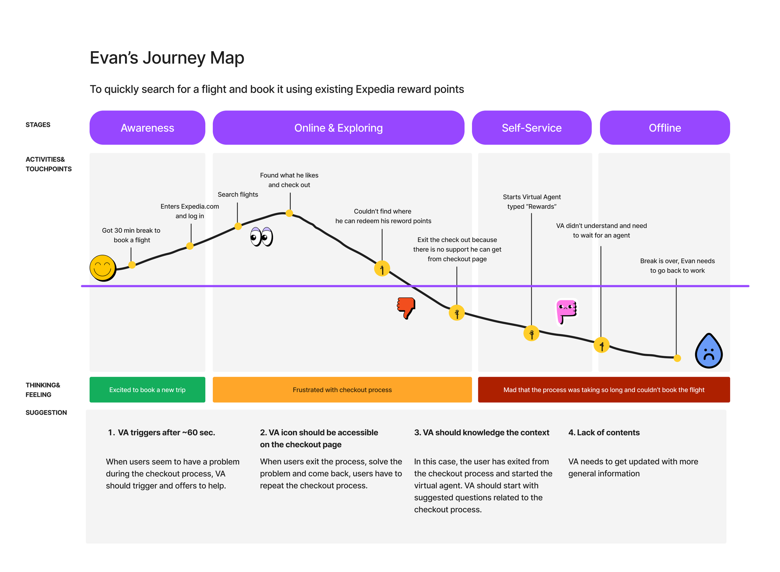
At Expedia.com, users can utilize virtual agents to manage bookings, cancel reservations, and redeem credits. The virtual agent offer advantages such as enhanced efficiency and cost-effectiveness. However, users are currently encountering difficulties using the virtual agent and resorting to human agents for help. Our current focus is on improving the self-serve credit redemption process.


Previous research shows that only 6.5% of users can redeem credits using virtual agents. This suggests that most users experience difficulties using virtual agents for credit redemption. Our goal for this project is to redesign the current credit redemption flow to increase the success rate of credit redemption.


I. DISCOVER : Look for meaning

Competitor Analysis

Understanding Current VA Solution for Credit Redemption

Current User Flow

Affinity Mapping


Competitor Analysis

My team and I began the project with a competitive analysis. We aimed to identify our competitors' agents, their features, and how they help users achieve their goals.

We researched major airline websites and other websites with virtual agent features. During our analysis, we carefully evaluated the strengths and weaknesses of each website. We gathered analysis to leverage what works, avoid what doesn’t, and identify gaps to gain a competitive advantage. After understanding competitors' websites, we strategically designed our solution to make it a superior experience for our virtual agent.


Competitor Analysis findings:

User interaction awareness

  • Chatbot knows when the user has stepped away (right example)

  • Chatbot intuits what you want (left example)

Rich UI in chat when appropriate

  • Enable rich UI as appropriate for conversational standards

  • Smaller, bite-sized UI patterns

  • Link out to full UI when interactions are complex

  • Ability to edit aspects of bookings directly within the chat

Mini menu

  • Mini menu built into the text field

  • Possible options: Start over, Close, Home, Unmute sounds, Go back, Add attachment, etc. 

Guide users throughout the process

  • Confirms that user action is in process

  • Shows users where they are in the process

  • Gives confidence to the user that their goal is being met

Be transparent

  • Let users know when they are interacting with humans or bot

  • Give estimations of wait times

  • In cases of excessive wait times, allow users to self-serve by offering buttons/links to related topics

Help users recover easily

  • Provide a menu to start or navigate the chat

  • Reserve keywords like help, main menu, and back to help the user recover

Further assistance

  • When the chatbot doesn't understand what the user wants, the chatbot should provide some relative links or suggest a live agent for further assistance.

Opportunities for human connection

  • During information loading, instead of seeing the normal load graphic, human words of encouragement could keep users connected on a human level (ie: “Thank you for waiting”, “Still working…” etc.)


Current User Flow

We first examined our competitors, then took a closer look at our own virtual agent. We specifically examined the process for redeeming air credits and analyzed each step to identify any issues that users might encounter. We collected data and used affinity mapping to organize it, which helped us identify patterns and better understand the problems users are facing.


Problems to solve

We have analyzed the affinity map and identified three problems that need to be addressed.

  1. Expedia live site is missing Virtual Agent accessibility

    A large section of the user flow lacks accessibility to the Virtual Agent.

  2. Confusing carousel

    Shows previously canceled trips when you try to use credits for a new booking.

  3. Inconsistency

    Credit looks different depending on UI and context.


II. DEFINE : Edit insight

User Persona

Journey Mapping


User Persona and User Journey Map

For the next step, we created a User Persona and User Journey Map to showcase users' steps to accomplish a goal. Through these endeavors, we were able to determine the most crucial features that our audience requires, which helped us establish our design principles.


Principles

  1. Provide a seamless transition (to virtual agent or website) and let user know when it happens

  2. Provide clear steps for user goals

  3. Use logical navigational cues

  4. Respect the user’s time; aim for efficiency        

  5. Be thoughtful by using UI appropriate to the task

  6. Appear when needed and be accessible 24/7

  7. Offer chat as an available tool to choose from

  8. Interact with the user like a traveler – be relatable 


III. DEVELOP : Explore Possibilities

Early Stage - Lo-fi wireframes

Interim Solution

Design updates


Early Stage - Lo-fi wireframes

After compiling all the research data, we created low-fidelity wireframes. Drawing from insights gained through competitive analysis, we incorporated new features such as a virtual agent to assist in identifying the top three flight options based on a different date and location, a mini menu, and a credit history review. Unfortunately, due to technical constraints, we had to temporarily forgo these advanced features and opt for the interim solution.


Northstar Lo-fi

Interim Solution - Lo-fi wireframes

The interim solution included the following:

  1. Make the virtual agent icon accessible throughout the user flow.

  2. Efficiently display credit information in an updated UI carousel.

  3. When users select a new travel date or location on the virtual agent page, they will be transferred to the Expedia flight search page.

Interim Solution

Credit information UI - Design revisions


IIII. DELIVER : Prototype, Test, Revise and Repeat

Final Prototype

Main updates

Usability testing

Next Steps


Final Prototype

After several rounds of user testing and design revisions, we have arrived at a final prototype for an interim solution.


Main updates:

Update #1 - Flight booking screen

Prior to the update, users could only book new flights using credit within the limited virtual agent screen. However, after the update, users are now able to search and find new flights on the Expedia website.

Update #2 - Virtual Agent accessibility

Once users are transferred from the Virtual Agent screen to the Expedia website, they can find the Virtual Agent icon available in the bottom right corner throughout their user flow. This new feature is designed to assist users who may have any questions during their search for flights or when checking out.

Update #3 - New credit information carousel

When users were trying to check their credits for a new booking, the virtual agent displayed information about their previously cancelled trips, leading to confusion. Additionally, the virtual assistant provided credit information with lengthy text, which proved to be inefficient for users. After several revisions, we have developed a new credit information carousel that features a simplified design.


Usability testing


After creating the final prototype, we wanted to test its usability through UserTesting.com. Our primary focus was observing how travelers prefer using the Virtual Agent (VA) to solve problems and get answers to redeem air credits. The overall result was positive; travelers found the new credit redemption process easy, and the search page's transition felt natural. They also clarified the new credit information carousel and recognized that one credit type required contacting an agent. Following this round of testing, we were able to launch the new credit redemption flow on VA.


 Next Steps >

  • Customer Feedback

  • Northstar version update

Thank you!


Say Hello!


kinoh91@gmail.com
irenenoh.com
https://www.linkedin.com/in/irene-noh/